In this blog, we can use the chart control to display data in a Canvas app. To display data, we can use a variety of charts such as line charts, pie charts, bar charts, and so on.

In order for the data to be used in chart controls, we must ensure that the data is properly structured. We’ll use a PowerApps collection for this.

PowerApps Chart Control Configuration

Now we’ll look at how to add a chart control to our PowerApps app and how to configure it.

Open PowerApps -> Create a Canvas app from scratch -> Create a Mobile or Tablet view app.

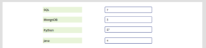
Then, as shown in the screenshot below, drag and drop four Textboxes and a column chart onto the screen.

Next, in PowerApps, I created a collection called course, which I defined in all Text boxes OnChange properties as shown below.

ClearCollect( course,
{
Sql: TextInput1.Text,
MongoDB: TextInput1_1.Text,
Python:TextInput1_2.Text,
Java: TextInput1_3.Text
}
)

In the collection section, you can now see my collection being created. As a result, we can use this collection in the column chart in the following step.

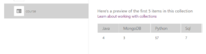
Next, choose column chart and connect the items to the newly created collection as Datasource. When the connection is successful, all of your collection data will be displayed in this chart control.

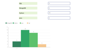
When you add items to the textbox, the chart will automatically update based on the value of the textbox. To verify this, run the app.