
Icons can easily be added to Power Apps buttons with a little bit of creative coding. The trick is to place an icon on top of the button. Then trigger both the icon and button to change color when an invisible overlay above them is pressed. We can add a subtle hover effect on the button too. In the Power Apps article, I will teach you how to make a button with an icon and text.
Add A Container To Hold The Button & Icon
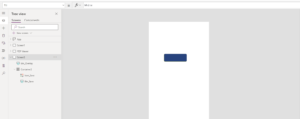
Open Power Apps Studio and start a new app from blank. Add a container control to the app. The Power Apps button with an icon will be built inside of the container to make it easier to maintain.
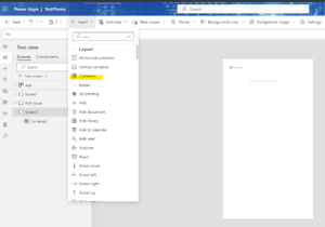
Change the height and width properties of the container to the values height 80 and width 240 to my container.
Create A Power Apps Button Inside The Container
Insert the new Button to the screen onselect: Container2.Width-Self.BorderThickness
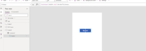
Make the button fill the entire space inside the container by updating its properties with the values below. It the container is re-sized, the button will re-size itself too. This makes our button with an icon re-usable in other places.
Height: Container2.Height-Self.BorderThickness
Width: Container2.Width-Self.BorderThickness
X: Self.BorderThickness/2
Y: Self.BorderThickness/2
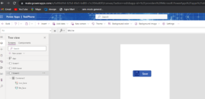
Update the button’s text to the word Save. Position the text on the right side of the button. Leave a blank space for a button on the left-side.
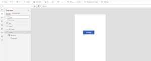
Change the button properties to this code to re-position the text.
Align: Center
PaddingLeft 80
PaddingRight: 0
PaddingTop: 0
PaddingBottom: 0
Insert An Icon Into The Container
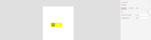
Create a Save icon named ico_Save and place it in the container. Position the icon to the left of the Save text.
Position An Overlay Button
Above The Icon & Save Button
To make the icon and the save button’s color change at the same time they need to be triggered by common event. We will place a transparent button on top of the other controls. Then, when the transparent button’s pressed output property changes to true the icon and button will change color.
Insert a new button called btn_Overlay into the container.
Position the new overlay button directly over top of btn_Save.
Height: Btn_Save.Height
Width: Btn_Save.Width
X: Btn_Save.X
Y: Btn_Save.Y
Use this code to make the button see-through. Notice the HoverFill property is not fully transparent. This gives the button a subtle hover effect.
BorderStyle: BorderStyle.None
Color: Transparent
Fill: Transparent
DisabledColor: Transparent
DisabledFill: Transparent
HoverColor: Transparent
HoverFill: RGBA(0,0,0,0.05)
PressedColor: Transparent
PressedFill: Transparent
For any Help or Queries Contact us on info@crmonce.com or +918096556344